Significance testing of correlation coefficient
T. Dhasaratharaman*
Statistician, Kauvery Hospitals, India
*Correspondence: Tel: +91 90037 84310 Email: dhasa.cst@kauveryhospital.com
Where there is a linear relationship between two variables there is said to be a correlation between them. Examples are height and weight in children, or socio-economic class and mortality.
The strength of that relationship is given by the “correlation coefficient”.
Interpretation
The correlation coefficient is usually denoted by the letter “r” for example r = 0.8.
SPSS 23.0 Software – Analyze – Correlate – Bivariate.
A positive correlation coefficient means that as one variable is increasing the value for the other variable is also increasing – the line on the graph slopes up from left to right. Height and weight have a positive correlation: children get heavier as they grow taller.
A negative correlation coefficient means that as the value of one variable goes up the value for the other variable goes down – the graph slopes down from left to right. Higher socio-economic class is associated with a lower mortality, giving a negative correlation between the two variables.
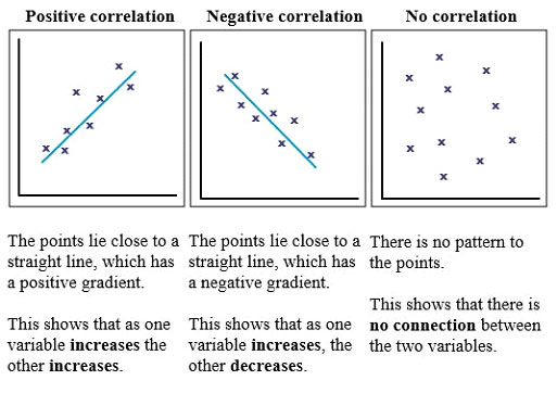
If there is a perfect relationship between the two variables, then r = 1 (if a positive correlation) or r = -1 (if a negative correlation).
If there is no correlation at all (the points on the graph are completely randomly scattered) then r = 0.
The following is a good rule of thumb when considering the size of a correlation:
r = 0-0.2: very low and probably meaningless.
r = 0.2-0.4: a low correlation that might warrant further investigation.
r = 0.4-0.6: a reasonable correlation.
r = 0.6-0.8: a high correlation.
r = 0.8-1: a very high correlation. Possibly too high! Check for errors or other reasons for such a high correlation.
The same applies to negative correlations too.
Example 1
A nurse wanted to be able to predict the laboratory HbA1c result (a measure of blood glucose control) from the fasting blood glucoses which she measured in her clinic. On 12 consecutive diabetic patients she noted the fasting glucose and simultaneously drew blood for HbA1c. She compared the pairs of measurements and drew the graph.
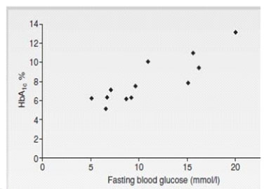
For these results r = 0.88, showing a very high correlation.
A graph like this is known as a “scatter plot”.
Example 2
An occupational therapist developed a scale for measuring physical activity and wondered how much it correlated to Body Mass Index (BMI) in 12 of her adult patients.
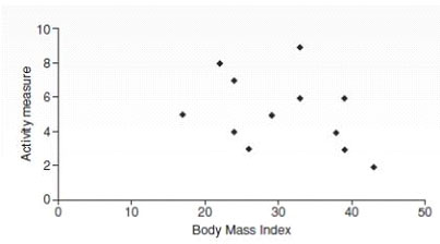
In this example, r = -0.34, indicating a low correlation.
The fact that the r value is negative shows that the correlation is negative, indicating that patients with a higher level of physical activity tended to have a lower BMI.
Caution
Correlation tells us how strong the association between the variables is, but does not tell us about cause and effect in that relationship.
The “Pearson correlation coefficient”, Pearson’s r, is used if the values are sampled from “normal” populations. Otherwise the “Spearman correlation coefficient” is used. However, the interpretation of the two is the same.
Where the author shows the graph, you can get a good idea from the scatter as to how strong the relationship is without needing to know the r value.
It is very easy for authors to compare a large number of variables using correlation and only present the ones that happen to be significant. So, check to make sure there is a plausible explanation for any significant correlations.
Also bear in mind that a correlation only tells us about linear (straight line) relationships between variables. Two variables may be strongly related but not in a straight line, giving a low correlation coefficient.
Journals
- EDITORIAL
- Rare and complex type of MS, tumefactive multiple sclerosis
- Dilemma of decoding a difficult fever
- IMAGE CHALLENGE DIAGNOSTIC IMAGE
- PATIENT’S VOICE – A BOLT FROM THE BLUE
- THE UNIQUE MIND AN ANTHOLOGY OF POEMS
- EDITORIAL
- EDITORIAL BOARD
- SARS-CoV-2 Vaccination Before Elective Surgery
- Evolution of Dashboards and its Effectiveness in Performance Management and Efficient Utilization of Time and Energy
- Anorexia Nervosa with Compulsive Exercising – A Case Report
- From the Desk of the Editor-in-Chief
- Section Editor
- PATIENT’S STORY
- The Un-Relished Performance
- THE ELECTRONIC MEDICAL JOURNAL OF KAUVERY HOSPITALS
- Vascular Covid Diaries
- Encephalitis – a success story
- Intracoronary imaging
- Patient’s Voice
- THE CURE BY KAANTHAL MANIKANDAN
- SEIZURE IN A NEWBORN
- SGLT 2 inhibitors in kidney disease
- Editor’s message – Dr Venkita S Suresh
- Preparing your manuscript
- Pulmonary valve endocarditis: a case report
- Upper limb replantations at different anatomical levels: a short case series Kiran Petkar
- Prevalence of vitamin B12, folate deficiency and homocysteine elevation in ASCVD or venous thrombosis
- HENOCH SCHOENLEIN PURPURA
- Life turns upside down for a young couple and family
- Vaccine Induced Cerebro Venous Thrombosis with Thrombocytopenia (VITT) – A Case Report
- Editor-in-Chief
- EDITORIAL
- Neurobiology of Romantic Love
- An interdisciplinary approach to treatment of juvenile OCD: a case report
- Fanconi Anaemia – Need to look at the whole picture
- The Art and Science of Preparation and Publication of Medical Research from Kauvery Hospitals
- FUNDAMENTALS OF STATISTICS
- Diagnostics Images
- A WAKE-UP CALL FROM THE ANAESTHESIOLOGIST, BY DR. VASANTHI VIDYASAGARAN
- A PATIENT’S STORY
- THE FALLACIES OF PERFECTION
- EDITORIAL
- EDITORIAL BOARD
- Difficult to Treat Epilepsy: A Management Primer for Non-Neurologists
- Clinical audit: A Simplified Approachs
- Rationalise and Restrict Antibiotic Use by Utilizing A Proactive Justification Form and Comparing with Earlier Antibiotic Usage in The Same Paediatric Unit in A Tertiary Care Centre
- COVID-19 and Fungal Infection – An Opportune Time: A Case Series
- Thymidine phosphorylase (TYMP) gene stop mutation, G38X, in a familial case of mitochondrial neurogastrointestinal encephalomyopathy
- Image Challenge
- PATIENT’S STORY
- ANTHOLOGY OF POEMS
- POEM
- POEM
- EDITORIAL
- EDITORIAL BOARD
- Hypertension – a renal disease
- A New Cause for Confusion or Concern – A Case Series
- A rare case of acute aortic dissection secondary to a penetrating aortic ulcer in the ascending aorta
- Pacemaker in children – big shoes to fill for small foot
- The Eight Roles of The Medical Teacher – The Purpose and Functions of a Teacher in The Healthcare Professions by Ronald M. Harden & Pat Lilley
- Reducing the stock items – Need to look at the whole picture
- DIAGNOSTIC IMAGES
- Mountain behind a mountain
- The Disappearing Act
- EDITORIAL
- EDITORIAL BOARD
- TO CRUSH OR NOT TO CRUSH? DON’T RUSH TO CRUSH!
- Effectiveness of Pre – Clinical Competency Certification Program on Improving Knowledge of Clinical Practice Among Nursing Internship Students
- Medical Statistics in Clinical Research – Mean, Median, Standard Deviation, p-value, Chi Squared test
- Vertebral artery dissection with thrombosis causing neuralgic amyotrophy
- Atypical Electrical Alternans Due to Large Left Pleural Effusion
- Early presentation of a rare disorder
- DIAGNOSTIC IMAGES
- PATIENT’S STORY
- ANTHOLOGY OF POEMS
- EDITORIAL
- EDITORIAL BOARD
- GUEST EDITORIAL
- Clinical MIS – A Clinical Analyst Review
- Eclampsia and HELLP Syndrome: A Case Report
- Percutaneous Device Closure in A Toddler with PDA and Interrupted IVC
- Pediatric Car Passenger Trauma – A Case Report and A Review of Child Safety Inside a Car
- Use Of Antibody Cocktail, Regn-Cov2, In Two Non-Hodgkin’s Lymphoma (NHL) Patients with Mild Covid-19 Disease, At A Tertiary Care Hospital in South India: A Case Series
- Neurology Update
- DIAGNOSTIC IMAGES
- The Patient Is Always Right
- Humanity’s Most Cherished Fiction
- DVT in a child: A case to introspect
- Rainbow within a storm
- Reversal of Dabigatran in patients with intracerebral haemorrhage – a narrative review
- EDITORIAL
- EDITORIAL BOARD
- GUEST EDITORIAL
- Convalescent Plasma Therapy in Covid-19: A Question of Timing
- High Dose methotrexate in Children with Cancer Without Drug Level Monitoring – 133 Cycles Experience
- Prenatal diagnosis in Thalassemia – Prevention is better than cure
- Improving Outcomes in Children with Cancer – Our Experience
- Autologous Stem Cell Transplantation for Myeloma with CKD
- All Megakaryocytic Macrothrombocytopenia Are Not ITP
- Telomeropathies and Our Experience: A Case Series
- Neurology Update – Neurobiology of Sleep
- Journal scan: A review of twelve recent papers of immediate clinical significance, harvested from major international journals
- The Brush Stroke
- A rare case of flood syndrome: a case report of fatal complication of umbilical hernia in liver cirrhosis
- Editorial
- Kauverian eMedical Journal
- COVID-19 and the Change in Perspective: Musings of Two Seasoned Pediatricians
- World Prematurity Day: Reflections of a Neonatologist
- Epilepsy in Kids: Problems Beyond Seizures
- Overcoming Challenges and Performing First Paediatric Allogenic Bone Marrow Transplantation in Trichy
- Vaccine Induced Cerebro Venous Thrombosis with Thrombocytopenia (VITT) – A Case Report
- DX ICD Implanted After Unmasking Brugada – A Case Study
- DNB Thesis
- Kauvery 4th Annual Nursing Conclave N4 – 2021
- Learning from Experience – 13 and 14
- The Consultation Room
- Journal Scan
- Recommended Reading
- Diagnostic Image
- From Sand to Sky
- Editorial
- Kauverian eMedical Journal
- Transfusion-related acute lung injury
- Equalizing leg length by “lengthening the shorter leg” by surgery: a case report
- VKA induced catastrophic bleeding management with Prothrombin Complex Concentrate (PCC): a practice changer
- “Kanvali Kizhangu” Toxicity – A Curious Case Report
- Orthopaedics case series
- Morbidity and mortality meetings for improved patient care
- Significance of waist to height ratio as an early predictor in developing metabolic syndrome in children of age group 5-12 years in a tertiary care centre in Trichy: Part IV
- Chapter 15
- The Consultation Room
- Journal scan: A review of 10 recent papers of immediate clinical significance, harvested from major international journals
- Recommended Reading
- Measuring Association in Case-Control Studies
- DIAGNOSTIC IMAGE
- The Stream of Life
- Kauverian eMedical Journal
- Let’s prepare for the unexpected guest who always arrives at odd hours: Pre-eclampsia
- Cerebrospinal fluid-cutaneous fistula after neuraxial procedure and management: a case report
- Impella CP assisted recovery of acute COVID 19 fulminant myocarditis presenting as out of hospital cardiac arrest and cardiogenic shock
- Ischemic stroke after Russel’s Viper snake bite, an infrequent event: a case report
- Nutrition needs of preterm babies
- Chapter 17
- The Consultation Room
- Journal scan: A review of 10 recent papers of immediate clinical significance, harvested from major international journals
- DIAGNOSTIC IMAGE
- Tick Talk
- EDITORIAL
- EDITORIAL BOARD
- Cervical collar in trauma patients – friend or foe?
- Oxygen conservation strategies
- Chronic periodontitis: a case report
- Erythema multiforme in COVID-19: a case report
- Secondary Synovial Chondromatosis of the knee Joint-a case report
- Statistical Risk Ratio (Relative Risk) Data Analysis
- Journal scan: A review of ten recent papers of immediate clinical significance, harvested from major international journals
- Splinter Haemorrhage
- Dignity matters
- Where does time fly to?
- DIAGNOSTIC IMAGE 1
- Editorial
- Editorial Board
- ABO incompatible renal transplant in a post COVID patient with COVID antibodies
- Neuromyelitis Optica early presentation of an adult disorder
- The gamut of neurological disorders associated with COVID-19
- Anaesthetic management of patients with Takayasu arteritis
- My Pains and Gains in Becoming A Doctor
- Significance testing of correlation coefficient
- Journal scan: A review of ten recent papers of immediate clinical significance, harvested from major international journals
- While you were sleeping
- Subliminal Sublimes (Sonnet 1)
- Editorial
- Instructions for Authors
- COVID-19 and mucormycosis: the dual threat
- COVID-19 associated mucormycosis: efforts and challenges
- Saccular abdominal aortic aneurysms: a case series
- Trauma and OCD – A Case of a Boy with Dark Fears
- Chapter 3
- Journal scan: A review of 10 recent papers of immediate clinical significance, harvested from major international journals
- The Consultation Room
- DIAGNOSTIC IMAGE
- A Patient’s Perception of Pulmonology
- Just a leaf
- Editorial
- Editorial Board
- Dilemma of shadows
- One-year journey in Kauvery! Challenges in Neuroanaesthesia and Neurointensive care
- Leadless pacemakers: The future of pacing?
- Clinical Therapeutics: The polymyxins, existing challenges and new opportunities
- Decision to Take Up a Patient in The Presence of Arrhythmias
- Why growing public dissatisfaction about medical profession?
- JOURNAL SCAN
- Diagnostic Image
- The cloud over a young life
- The Waiting Room
- Author Instruction
- Editorial
- Editorial Board
- The French Connection!
- Rare cause of pyrexia of unknown origin: Primary gastrointestinal non-Hodgkin’s lymphoma
- Impact of multi-disciplinary tumour board (MDT) on cancer care
- WPW pathway ablated from uncommon location
- Statistical hypothesis – using the t-test
- Learning from Experience – Chapters 6 and 7
- The Consultation Room
- Journal scan: A review of 10 recent papers of immediate clinical significance, harvested from major international journals
- Diagnostic Image
- When the sun sets over a good life
- The Deepening Dent
- Save Farmers, Save Future
- Editorial
- Editorial Board
- Guest Editorial
- Significance of waist to height ratio as an early predictor in developing metabolic syndrome in children of age group 5-12 years in a tertiary care centre in Trichy: Part I
- Journal Club
- Statistical Non Parametric Mann – Whitney U test
- The Consultation Room
- Journal scan: A review of 10 recent papers of immediate clinical significance, harvested from major international journals
- Diagnostic Image
- Editorial
- Editorial Board
- Repurposing anti-rheumatic drugs in COVID
- An Effective Journal Club Presentation: A Guide
- A Masquerader Vasculitis as Usual: Time Is Tissue
- A Sinister Swelling: A Case Report
- DNB Thesis
- Statistical Regression Analysis
- Learning from Experience – 11 and 12
- The Consultation Room
- Journal Scan
- Diagnostic Image
- Stained not torn
- Editorial
- Author Instruction
- Interventional Nephrology
- Amplified Ears and Listening Brains
- Love makes life worth living
- Usage of Dapagliflozin in Elderly
- Severe Methemoglobinemia Treated Successfully with Oral Ascorbic Acid: A Case Report
- The new imitator
- Liver Cyst
- Learning from Experience – Intra Operative, Chapters 17 and 18
- The Consultation Room
- Journal scan
- Recommended Readings
- Editorial
- Evolution of Emergency Medicine in India and the Emergence of the MEM Program at Trichy
- Welcome to the Dance floor: The Emergency Room
- Life of An Emergency Physician
- A Racing Heart Beat: To Shock or Not
- Being Calm Amidst Chaos: Tips on How to Be an Expert Emergency Nurse
- COVID COVID everywhere, but not a place to run away from!
- Proud to be an Emergency Nurse: Life in the fast lane!!!
- The Journey of a Fresher Nurse in the ED
- Ready, Steady, Go!!! A brief on Green Corridor activation in Organ Transplantation
- An Elevator Story!!!
- Veno-occlusive mesenteric ischemia: A case report
- Stridor: An Alarming Sign in Emergency
- Amnesia in the ER: That Ghajini Moment!!! A Case series
- Survival After Paraquat Ingestion: A Case Series
- When you save one life, you save a family
- Severe Methemoglobinemia, Unresponsive to Methylene Blue
- Severe Meliodosis With Multisystemic Involvement: A Case Report
- A Case Report
- Recognize Rhabdomyolysis early to prevent Acute Kidney Injury and Acute Renal Failure
- New Onset Refractory Status Epilepticus (NORSE)
- Sensitive of EFAST in trauma in correlation with CT scan
- Sub Arachnoid Haemorrhage, management in Emergency and Neuro Intensive care
- Uncommon presentation of Takayasu Arteritis as a convulsive syncope
- All right sided hearts are not Dextrocardia
- COVID and the Salt Story
- Acute Lower Limb Ischemia: A Clue to Underlying Aortic Dissection
- Globe Injury with Orbital Blow Out Fracture
- The heat-stricken life – Treatment in time only saves lives!
- Pneumoperitoneum, does it have any clinical significance?
- Hypertensive Emergency in the ED
- Role of a paramedic in inter-hospital transfer
- Golden Hours in Safer Hands
- Through rough, crowded roads and stagnant waters – we race against time to reach you!
- Editorial
- Author Instruction
- Nana M, et al. Diagnosis and Management of COVID-19 in Pregnancy. BMJ 2022;377:e069739.
- MICS CABG with LIMA and Left Radial artery, harvested by Endoscopic technique: An ultrashort report
- Ultra-Short Case Report
- An interesting case of Bilateral Carotid aneurysms
- A Case Report
- Uterine artery embolization: Saving a mother and her motherhood
- Acute Abdomen – Sepsis – CIRCI: A Success Story
- Diagnostic Image
- Learning from Experience – Intra Operative, Chapters 19 and 20
- The Consultation Room
- Journal Scan
- Recommended Readings
- Editorial
- Kauverian eMedical Journal
- Cardiothoracic surgery in the COVID era: Revisiting the surgical algorithm
- Review
- Corona warrior award
- Case Series
- Takotsubo cardiomyopathy
- Learning from Experience – Chapters 3 and 4
- The Consultation Room – Chapters 41 to 45
- Journal scan
- Recommended Reading
- DIAGNOSTIC IMAGE
- Poem from Staff Nurse
- Editorial
- Author Instruction
- Male V. Menstruation and COVID-19 vaccination
- Efficacy and doses of Ulinastatin in treatment of Covid-19 a single centre study
- Electronic registries in health care
- A case report
- Anaemia in pneumonia: A case report
- Successful treatment of two cases of rare Movement Disorders
- Analysis of variance Two-Way ANOVA
- Learning from Experience – Chapters 5 and 6
- The Consultation Room
- Journal Scan
- Recommended Reading
- Diagnostic Image
- Poem from Staff Nurse
- Editorial
- Kauverian eMedical Journal
- An obituary, farewell to a very dear friend
- ‘Vitamin D’: One vitamin, many claims!
- Implantation of Leadless Pacemaker in a middle-aged patient: An ultra-short case study
- ABO-incompatible renal transplant at ease
- Basal cell adenoma parotid: A case report
- A case report
- Learning from Experience – Chapters 7 and 8
- The Consultation Room
- Journal Scan
- Recommended Reading
- Diagnostic Video
- Poem from Staff Nurse
- Editorial
- March – the Month for Minds to dwell on Multiple Myeloma
- Covid Report
- Research Protocol
- New Arrows in our Quiver, to direct against SARS-CoV-2 variants
- Out-of-hospital cardiac arrest
- Last on the list: A diagnosis seldom considered in males
- Giant T wave inversion associated with Stokes: Adams syndrome
- Learning from Experience – Intra Operative, Chapters 9 and 10
- The Consultation Room
- Definitions of probability
- Journal Scan
- Recommended Reading
- Diagnostic Video
- A Thanksgiving to Cardiac Surgeons
- Editorial
- Kauverian eMedical Journal
- Research Article
- Research Protocol
- Saving the unsavable
- Case Report
- Case Report
- Letters to the Editor
- Diagnostic Image
- Learning from Experience – Intra Operative, Chapters 13 and 14
- The Consultation Room
- Journal Scan
- Recommended Readings
- Editorial
- Author Instruction
- SIGARAM – The Club for Children with Diabetes
- The hope for a better tomorrow
- An unusual complication of polytrauma:
- An enigma at the ER
- Dynamic examination of airway
- Journal Club
- Journal Club
- Journal Club
- Conditional Probability
- Diagnostic Image
- Learning from Experience – Intra Operative, Chapters 15 and 16
- The Consultation Room
- Journal Scan
- Recommended Readings
- EDITORIAL
- Kauverian eMedical Journal
- Junior nurses in Kauvery Hospital on the frontline against the COVID-19 pandemic
- Emergency Medicine, the Emerging Specialty: Leading Light on the entrance to the Health Care Pathway
- Battle of two drugs: Who won? – An unusual presentation
- Return of the native and a resurrected foe: A case of Rhinocerebral Mucormycosis
- Covert invader- atypical presentation of neuronal migration disorder
- Fragile heart: an unusual cause of chest pain
- Goldberger’s ECG sign in Left Ventricular Aneurysm
- The Power of Purple
- Beads of Nature’s Rattle
- Case Report
- EDITORIAL
- Kauverian eMedical Journal
- Modification of Management Strategies, And Innovations, During SARS Cov2 Pandemic Improved the Quality, Criticality and Outcomes in In-Patients “Rising to the occasion”, the mantra for success in the COVID -19 pandemic
- Time in Range (TIR) In Diabetes: A Concept of Control of Glycemia, Whose Time Has Come
- Kauvery Heart Failure Registry- A Concept
- Shorter Course of Remdesivir In Moderate Covid-19 is as Efficacious as Compared to Standard Regime: An Observational Study
- CASE REPORT
- Lymphoepithelial Carcinoma: A Case Report of a Rare Tumour of The Vocal Cord
- Diabetic Keto Acidosis (DKA), Associated with Failed Thrombolysis with Streptokinase in Acute Myocardial Infarction
- EARNING FROM EXPERIENCE – CHAPTERS 1 AND 2
- The Consultation Room
- Journal scan
- Recommended Reading
- DIAGNOSTIC IMAGE
- Notes to Nocturne
- Editorial
- Kauverian eMedical Journal
- Caring for nobody’s baby
- Special Report
- Research Article
- The curious case of a migrating needle on the chest wall
- Foreign body: A boon at times
- Cardiorenal Syndrome
- What My Grandmother Knew About Dying
- Endovascular Therapy for Acute Stroke with a Large Ischemic Region. N Engl J Med. 2022
- Letter to the Editor
- Clinical outcomes of Coronary Artery Disease in Octogenarians
- Diagnostic Image
- Learning from Experience – Intra Operative, Chapters 11 and 12
- The Consultation Room
- Journal Scan
- Recommended Reading
- colours
- Editorial
- Author Instruction
- Ultrashort Case Report
- Cochlear Implantation: Expanding candidacy and Cost Effectiveness
- Spontaneous Pneumomediastinum in COVID 19 – Tertiary Care Centre Experience in South India
- Amoxycillin Induced Anaphylactic Shock: A Case Report
- An Unusual Cause of Seizures: A Case Report
- Case Report
- Educational Strategies to Promote Clinical Diagnostic Reasoning
- Rheumatic Rarities
- Types of sampling methods in statistics
- Diagnostic Image
- Learning from Experience – Intra Operative, Chapters 21 and 22
- The Consultation Room
- Journal Scan
- Recommended Readings
- Editorial
- Author Instruction
- Journal Scan
- Myeloma
- Posterior Reversible Encephalopathy Syndrome (PRES)
- Prophylactic orthopaedic surgery
- Subclavian steal: An interesting imaging scenario
- Spondylo-epi-metaphyseal dysplasia (SEMD)
- The bleeding windpipe
- Learning from Experience – Intra Operative, Chapters 23 and 24
- The Consultation Room
- Diagnostic Image
- Recommended Readings
- Editorial
- Editorial Board
- Physician, Protect thyself
- Foetal Medicine, the Future is here!
- Japanese Encephalitis: A common menace
- Carpometacarpal dislocation with impending compartment syndrome
- Heterotopic pregnancy
- Femoral Trochantric and Proximal Humerus Fracture, from Diagnosis to Rehabilitation
- My Father’s Heart Block
- EPS page
- CRT CSP Cases
- Journal scan
- Learning from Experience – Intra Operative, Chapters 25 and 26
- The Consultation Room
- Recommended Readings
- Editorial
- Editorial Board
- Multiple Sclerosis: An overview
- A flower born to blush unseen
- Guest Editorial
- Radio-frequency ablation as an effective treatment strategy in a case of VT storm post STEMI
- Lymphatic malformation of tongue
- Bilateral anterior shoulder dislocation in epilepsy: A case report and review of literature
- An unusual cause of Stridor
- Monoclonal Antibodies (mAbs) – the magic bullets: A review of therapeutic applications and its future perspectives
- Write the Talk
- Press release and Comments
- Probability Distribution of Bernoulli Trials
- Journal Scan
- Recommended Readings
- poem-v4i4
- Editorial
- Editorial Board
- Research
- Research
- Lambda-cyhalothrin and pyrethrin poisoning: A case report
- Good Enough
- The Monoclonal antibodies (mAbs): the beginning
- Comprehensive trauma course 2022: Trauma Management & Kauvery
- Comprehensive trauma course 2022: Introduction to Comprehensive trauma course
- Diagnostic Image
- Learning from Experience – Intra Operative, Chapters 27 and 28
- The Consultation Room
- Recommended Readings
- Poem
- Editorial
- The Brave New World of Anaesthesia
- Anesthetic considerations in Wilson’s disease for fess: A case report
- The painful story behind modern anaesthesia
- Anesthesia considerations for Ankyslosing Spondylitis
- Total intravenous anaesthesia: An overview
- Risk stratification for cardiac patients coming for non-cardiac surgeries
- The Anaesthesiologist’s role in fluoroscopic guided epidural steroid injections for low back pain
- Awake Craniotomy
- Malpositioned central venous catheter: Step wise approach to avoid, identify and manage
- Benefits outweighing risk: Neuraxial anaesthesia in a patient with Spina Bifida with operated Meningomyelocele
- Pain free CABG: newer horizon of minimally invasive cardiothoracic surgery a walk through anaesthesiologist perspective
- Stellate Ganglion Block: A bridge to cervical sympathectomy in refractory Long QT Syndrome
- Venous Malformation in Upper Airway – Anesthetic Challenges and Management: A Case Report
- Editorial
- USG guided peripheral nerve block in surgery for hernia
- Anaesthesia and morbid obesity: A systematic review
- Patient-Controlled Analgesia
- Parapharyngeal abscess of face and neck: Anesthetic management
- 3D TEE, a boon for the diagnosis of Left Atrial Appendage thrombus!
- Anaesthetic management of difficult airway due to retropharyngeal abscess and cervical spondylosis
- Expect the unexpected – Breach in continuous nerve block catheter
- Lignocaine nasal spray: An easy remedy for Post Dural Puncture Headache
- Potassium permanganate poisoning and airway oedema
- Angioedema following anti-snake venom administration
- Editorial
- Editorial Board
- Ra Fx ablation of Atrioventricular nodal reciprocating tachycardia
- Pace and Ablate Strategy: Conduction system pacing with AV junction ablation for drug refractory atrial arrhythmia – A novel approach
- Why Cardiac Resynchronization Therapy (CRT) For complete heart block? A case discussion
- Pacemakers and Bradyarrhythmias in Diabetic Mellitus
- Outcomes of Total Knee Arthroplasty in patients aged 70 years and above
- An approach to CBC for practitioners
- Acute cerebral sinus venous thrombosis with different presentations and different outcomes: A case series
- Diet and nutritional care for DDLT: A case study
- Vaccine for Dengue (Dengvaxia CYD-TDV)
- Diagnostic Image
- Learning from Experience – Intra Operative, Chapters 31 and 32
- Recommended Readings
- காவிரித்தாய்
- ATLAS OF HAEMATOLOGY AND HEMATOONCOLOGY
- Editorial
- Editorial Board
- Case reports and Case series:
- Usefulness of NEWS 2 score in monitoring patients with cytokine storm of COVID-19 pneumonia
- Treatment approach for extensively Drug-Resistant Tuberculosis (XDR-TB)
- Modified Lichtenstein mesh repair, for a patient of Coronary Artery Disease, Heart Failure and with Implanted Cardioverter- Defibrillator
- Fever-induced Brugada Syndrome
- Pulmonary Thrombo Embolism: When to Thrombolyse?
- Ultra-Short Case Report
- Learning from the failure of Nebacumab
- Journal scan
- Learning From Experience Intra Operative Chapters 29 and 30
- Recommended Readings
- Poem
- Editorial
- Editorial Board
- Heart transplantation: Life beyond the end of life
- Azithromycin to Prevent Sepsis or Death in Women Planning a Vaginal
- Medial retropharyngeal nodal region sparing radiotherapy versus standard radiotherapy
- Proximie: Patient safety in surgery – the urgent need for reform
- Analysis of femoral neck fracture in octogenarians and its management
- Adult Immunisation in Clinical Practice: A Neglected Life Saver
- “Icing” The Eyes
- Doppler vascular mapping in Arterio Venous Fistula (AVF)
- Cosmesis and cure: Radiotherapy in basal cell carcinoma of the dorsum of nose – A case report
- Pulmonary Hypertension and Portal Hypertension
- Comprehensive review of Drug-Induced Cardiotoxicity
- Statistics – Data Collection – Case Study Method
- Atlas of Haematology and Hematooncology
- PRE-OPERATIVE Chapters 1 and 2 – Learning from Experience
- Chapter 2. Uncertainties in medicine in spite of advances
- No Splendid Child
- Editorial
- Editorial Board
- A Young Girl Lost in the Storm
- ECMO as a bridge to Transplant: A case report
- Renal anemia – from bench to bedside
- Mission Possible
- New kids on the block – Update on diabetic nephropathy therapy
- Infections – Trade off in Transplants
- To Give Or Not to Give – Primer on Bicarbonate Therapy
- Sialendoscopy: Shifting paradigms in treatment of salivary gland disease
- Gait imbalance in a senior due to Chronic Immune Sensory Polyneuropathy (CISP)
- Statistics – Mcnemar Test
- Atlas Of Haematology And Hematooncology
- PRE-OPERATIVE Chapters 3 and 4 – Learning from Experience
- Changing trends a challenge to the already trained
- Journal scan
- Recommended Readings
- EDITORIAL
- EDITORIAL BOARD
- PREGNANCY POST-RENAL TRANSPLANT
- BALLOON-OCCLUDED RETROGRADE TRANSVENOUS OBLITERATION
- REVERSE SHOULDER ARTHROPLASTY FOR ROTATOR CUFF ARTHROPATHY
- THE AMBUSH A TEAM APPROACH
- ENDOSCOPIC TRANS-SPHENOID APPROACH FOR PITUITARY ADENOMA EXCISION
- A STUDY ON PRESENTATION AND OUTCOME OF BULL GORE INJURIES IN A GROUP OF TERTIARY CARE HOSPITALS
- A CASE OF INTERNUCLEAR OPHTHALMOPARESIS AS THE FIRST MANIFESTATION OF MULTIPLE SCLEROSIS
- GRANULOMATOSIS WITH POLYANGITIS AND LUNG INVOLVMENT (WEGENER’S DISEASE)
- RITUXIMAB (RITUXAN, MABTHERA) IN THE TREATMENT OF B-CELL NON-HODGKIN’S LYMPHOMA
- STATISTICAL SIGNIFICANCE
- Atlas Of Haematology And Hematooncology
- PRE-OPERATIVE CHAPTERS 5 AND 6 – LEARNING FROM EXPERIENCE
- Chapter 4: Diagnostic process often reversed
- Journal scan: A review of 25 recent papers of immediate clinical significance, harvested from major international journals
- Recommended Readings
- ஆரோக்கியம் நம் கையில்
- வெற்றியின் பாதை
- Editorial
- Editorial Board
- Prevalence of vitamin D deficiency in a multi-speciality hospital orthopaedic outpatient clinic
- Esomeprazole induced Hypoglycemia
- Dynamic external fixator for unstable intra articular fractures of Proximal Interphalangeal Joint (PIP): “Suzuki” frame
- How to Practice Academic Medicine and Publish from Developing Countries? A Practical Guide, Springer Nature, 2022
- WINTNCON 2022 – Scientific Program
- Pulmonary Thrombo Embolism: A state of the art review
- Role of Artificial Intelligence in improving EHR/EMR and Medical Coding and billing
- Monoclonal Antibodies: Edrecolomab and Abciximab
- Atlas of haematology and hematooncology
- Journal scan
- Learning from Experience – Intra Operative, Chapters 31 and 32
- What doctors must learn: Doctor, look beyond science
- Recommended Readings
- I Whisper Secrets In My Ear
- EDITORIAL
- Instructions for Authors
- Mismatched Haploidentical Bone Marrow Transplantation in a 10-year-old boy with relapsed refractory acute lymphoblastic leukemia, at Trichy
- ST-Segment Elevation is not always Myocardial Infarction
- Acyanotic Congenital Heart Disease, repaired, evolves into a Cyanotic Congenital Heart Disease and presents with an atrial tachycardia
- Family medicine – caring for you for the whole of your life. A Lost and Found Art
- The Principles and Practice of Family Medicine
- Complete Heart Block
- Sick Sinus Syndrome (SSS)
- The First Ever National Award Comes to Kauvery Hospital Chennai & Heart City for Safety and Workforce Category in IMC RBNQA Milestone Merits Recognition 2022
- Diagnostic Image
- PRE-OPERATIVE CHAPTERS 7 AND 7 – LEARNING FROM EXPERIENCE
- Chapter 5: Super-specialist – boon or bane
- Journal scan: A review of 42 recent papers of immediate clinical significance, harvested from major international journals
- RECOMMENDED READINGS
- நேரம் ஒதுக்கு
- மருத்துவரின் மகத்துவம்
- EDITORIAL
- Instructions for Authors
- Surgical Management of Covid-19 Associated Rhino-Orbito-Cerebral-Mucormycosis (Ca-Rocm) – A Single Centre Experience
- Knee Joint Preservation Surgeries
- Guest Editorial Comments
- Ventricular Septal (VSR) closure with ASD device
- Newer Calcium Debulking Angioplasty technique of Orbital Atherectomy
- An hour-long CPR to restart the heart
- VT or SVT with aberrancy?
- Pituitary Neuroendocrine Tumor (PitNET)
- VSD Device Closure
- PDA Device Closure
- Iron Deficiency Anemia, Post MVR
- Torsades de Pointes
- Quality improvement project to Reducing the Malnutrition Rate of ICU patients from 43% to 20%
- Long term use of Amiodarone in Cardiac patients: A Clinical Audit
- Statistical Independent Events and Probability
- PERI-OPERATIVE Chapters 9 and 10 – Learning from Experience
- Journal scan: A review of 40 recent papers of immediate clinical significance, harvested from major international journals
- EDITORIAL
- Kauverian Medical Journal
- First da Vinci Robotic Surgery in Carcinoma Prostate: A Case Report
- Black burden or Taylor the saviour: A case report
- Analysis of differences in Oncology practice between the United Kingdom and India
- A Case of Takayasu Arteritis
- Idiopathic Dilated Pulmonary Artery (IDPA)
- ECG Atlas
- Unusual cause of Dysphagia: A case report
- Tu Youyou: The scientist who discovered artemisinin
- Continuing Nursing Education (CNE) on Risk assessment tools, to assess vulnerable patients at Kauvery Hospital, Tennur
- DIAGNOSTIC IMAGE
- PRE-OPERATIVE CHAPTERS 11 AND 12 – LEARNING FROM EXPERIENCE
- OLD AND NEW – MAKE THE BEST OF THE TWO
- Journal scan: A review of 30 recent papers of immediate clinical significance, harvested from major international journals
- Recommended Readings
- EDITORIAL
- INSTRUCTION TO AUTHORS
- A pregnant patient with DKA, septic shock and a lactate mystery
- Radical Thymectomy in Myasthenia Gravis through Partial Sternotomy approach: A report on three patients
- In-utero blood transfusion in two etiologically distinct anaemic fetus
- RARE CAUSE OF PULMONARY HYPERTENSION
- Acute Rheumatic fever is still an enigma
- A remarkable journey: Managing LQTS in a 43-year-old female with recurrent syncope and seizure
- An unusual case of Acute Coronary Syndrome
- Reversible cause of severe LV Dysfunction in Left Bundle Branch Block
- A case study on Rhino-Orbital-Cerebro- Mucormycosis
- Snakebite and its management
- Total Elbow arthroplasty in Post Traumatic arthritis
- Wellens Syndrome: An ECG finding not to miss!
- Dr. C.R. Rao Wins Top Statistics Award a look back at his pioneering work
- PRE-OPERATIVE Chapters 13 and 14 – Learning from Experience
- Chapter 7. Doctor-patient relationship
- Journal scan: A review of 30 recent papers of immediate clinical significance, harvested from major international journals
- EDITORIAL
- INSTRUCTION TO AUTHORS
- FROZEN ELEPHANT TRUNK (FET) PROCEDURE IN A 52 YEARS OLD CHRONIC AORTIC DISSECTION PATIENT
- DIAGNOSING AND MANAGING EISENMENGER SYNDROME IN A YOUNG MALE
- STEMI EQUIVALENT BUT STEMI!
- TEMPORARY HEAL CAN POSSIBLY KILL!
- UNDERSTANDING PUBERTY
- THE IMPORTANCE OF STATISTICS IN HEALTHCARE
- JOURNAL SCAN: A REVIEW OF 44 RECENT PAPERS OF IMMEDIATE CLINICAL SIGNIFICANCE, HARVESTED FROM MAJOR INTERNATIONAL JOURNALS
- DIAGNOSTIC IMAGE
- PRE-OPERATIVE CHAPTERS 15 AND 16 – LEARNING FROM EXPERIENCE
- CHAPTER 8. DOCTOR-DOCTOR RELATIONSHIP
- EDITORIAL
- GUEST EDITORIAL
- CLINICAL AUDIT: AN INTRODUCTION
- YOUNG ACS AUDIT
- CLINICAL AUDIT: ANAESTHESIA
- CLINICAL OUTCOME IN ICU PATIENTS
- RATE OF MALIGNANCY IN INDETERMINATE OVARIAN CYST – A PROCESS AUDIT
- PATTERNS OF NEEDLE DISPOSAL AMONG INSULIN USING PATIENTS WITH DIABETES MELLITUS: AN AUDIT
- CONTINUOUS PATIENT MONITORING – LIFE SIGNS
- AGE IS JUST A NUMBER!
- SVT WITH LEFT BUNDLE BRANCH BLOCK FOLLOWING GASTRECTOMY
- COMPLEX AORTIC DISSECTION WITH MULTIFACETED CLINICAL PRESENTATIONS
- EDITORIAL
- POST-OPERATIVE SORE THROAT IN GA: A CONCERN
- NEONATAL HLH: OUR EXPERIENCE
- CLINICAL REVIEW MEET 16TH NOV 2023: CHALLENGES IN SETTING UP A NEW HSCT CENTRE IN A TIER-2 CITY IN INDIA
- CARDIAC BIOMARKERS: CLINICAL UTILITY
- HIRAYAMA DISEASE: A CLINICAL-RADIOLOGICAL REVIEW
- ECG AS A WINDOW OF OPPORTUNITY: FOR HYPERKALEMIA
- EFFECTIVENESS OF ROOD’S APPROACH BASED PAEDIATRIC OCCUPATIONAL THERAPY MANAGEMENT: ON CHILDREN WITH CONGENITAL MUSCULAR TORTICOLLIS
- ELTROMBOPAG, A NOVEL THROMBOPOIETIN (TPO) RECEPTOR AGONIST: AN OVERVIEW
- HENOCH-SCHONLEIN PURPURA
- SUBMANDIBULAR GLAND SIALADENITIS SECONDARY TO SUBMANDIBULAR CALCULUS
- LEAN HOSPITALS
- STATISTICS BLACK-SCHOLES MODEL
- PERI-OPERATIVE CHAPTERS 17 AND 18 – LEARNING FROM EXPERIENCE
- CHAPTER 9. BUILDING BLOCKS OF PATIENT CARE
- JOURNAL SCAN: A REVIEW OF 30 RECENT PAPERS OF IMMEDIATE CLINICAL SIGNIFICANCE, HARVESTED FROM MAJOR INTERNATIONAL JOURNALS
- EDITORIAL
- INSTRUCTIONS TO AUTHORS
- ROTATHON-SERIES OF SUCCESSFUL ROTA CASES LAST 2 MONTHS: AN AUDIT
- OUTCOMES OF AKI AUDIT IN KAUVERY
- ETIOLOGY, CLINICAL CHARACTERISTICS AND OUTCOMES OF PATIENTS WITH ACUTE PANCREATITIS IN KAUVERY CANTONMENT HOSPITAL (KCN), TRICHY
- USE OF BLOOD PRODUCTS AND STEROIDS IN THE MANAGEMENT OF DENGUE AT KAUVERY TRICHY HOSPITALS: A CLINICAL AUDIT
- A CLINICAL AUDIT: ON THE MANAGEMENT OF ECTOPIC PREGNANCY
- DIABETIC KETOACIDOSIS WITH HIGH ANION GAP METABOLIC ACIDOSIS
- HYPOKALEMIC PARALYSIS FROM DISTAL RENAL TUBULAR ACIDOSIS (TYPE-1)
- DELAYED PRESENTATION OF INTERMEDIATE SYNDROME IN A PATIENT WITH ORGANOPHOSPHORUS POISONING: A CASE REPORT
- SCAPULA FRACTURES: DO WE NEED TO FIX THEM?
- SPONTANEOUS CSF RHINORRHEA
- DANCING WITH DIABETES: AN UNUSUAL CASE OF CHOREA HYPERGLYCEMIA BASAL GANGLIA SYNDROME
- CONVALESCENT RASH OF DENGUE
- ECG ATLAS 2
- MI MIMICKER
- PERFORATION PERITONITIS-A CASE REPORT
- APPLICATION OF EVIDENCE BASED PRACTICE CARE FOR INDIVIDUALS WITH SPINAL CORD INJURY WITH FUNCTIONAL DIFFICULTIES: ROLE OF THE OCCUPATIONAL THERAPY PRACTICE GUIDELINES
- METHOTREXATE INDUCED MUCOSITIS AND PANCYTOPENIA: A CONSEQUENCE OF MEDICATION ERROR IN A PSORIASIS PATIENT
- POST OPERATIVE CHAPTERS 1 AND 2 – LEARNING FROM EXPERIENCE
- CHAPTER 10. NURTURING SELF
- விடாமுயற்சி வெற்றி தரும்
- JOURNAL SCAN: A REVIEW OF 26 RECENT PAPERS OF IMMEDIATE CLINICAL SIGNIFICANCE, HARVESTED FROM MAJOR INTERNATIONAL JOURNALS
- EDITORIAL
- EDITORIAL BOARD
- LIMB SALVAGE IN EXTREMITY VASCULAR TRAUMA: OUR EXPERIENCE
- MANAGEMENT OF URETHRAL CATHETER RELATED PAIN IN RENAL TRANSPLANT RECIPIENTS: A CLINICAL AUDIT
- NO PAIN VEIN GAIN WITH PRILOX IN PAEDIATRIC POPULATION
- GUIDELINE-DIRECTED MEDICAL TREATMENT (GDMT) OF HEART FAILURE AT KAUVERY HOSPITALS: A CLINICAL AUDIT
- PATIENTS STORY: DIGNITY MATTERS
- PATIENTS STORY: DIGNITY MATTERS
- VIDEO PRESENTATION- CT CORONARY ANGIOGRAPHY
- DRUG INDUCED HYPERKALEMIA
- ADULT NEPHROTIC SYNDROME
- EXPLORING COMPLEX CARDIAC CASES: INSIGHTS FROM DIVERSE PRESENTATIONS IN MID-AGED WOMEN
- EFFECTIVENESS OF ACTIVITY CONFIGURATION APPROACH BASED OCCUPATIONAL THERAPY INTERVENTION FOR CHILDREN WITH CONGENITAL MUSCULAR TORTICOLLIS: A CASE STUDY
- CARDIOMYOPATHY AND ITS ECHO FINDINGS
- THE STRESS TEST ON THE TREADMILL
- POST OPERATIVE CHAPTERS 3 AND 4 – LEARNING FROM EXPERIENCE
- CHAPTER 11. BALANCE IN LIFE BEYOND BANK BALANCES
- JOURNAL SCAN: A REVIEW OF 30 RECENT PAPERS OF IMMEDIATE CLINICAL SIGNIFICANCE, HARVESTED FROM MAJOR INTERNATIONAL JOURNALS
- காணும் பொங்கலும் மனித மன மாற்றமும்
- EDITORIAL
- INSTRUCTIONS TO AUTHORS
- PREVALENCE OF STREPTOCOCCUS PNEUMONIAE SEROTYPES IN AND AROUND TRICHY AND ITS CLINICAL RELEVANCE
- ANAESTHETIC MANAGEMENT OF A PATIENT WITH HUGE GOITER: A CASE REPORT
- EUGLYCEMIC DIABETIC KETOACIDOSIS A RARE CAUSE FOR DELAYED EXTUBATION
- SUCCESSFUL PREGNANCY IN ASD PATIENT – COMPLICATED BY SEVERE PULMONARY ARTERIAL HYPERTENSION
- ENDOCRINE COMPLICATION OF GROWTH HORMONE SECRETING TUMOR: A CASE REPORT
- EFFICACY OF EARLY DIAGNOSIS AND DEVELOPMENT APPROACHES OF PAEDIATRIC OCCUPATIONAL THERAPY ON ACUTE DISSEMINATED ENCEPHALOMYELITIS: A CASE REPORT
- POST OPERATIVE CHAPTERS 5 AND 6 – LEARNING FROM EXPERIENCE
- CHAPTER 12. MILES TO GO – BEFORE TEACHING BECOMES LEARNING
- JOURNAL SCAN: A REVIEW OF 26 RECENT PAPERS OF IMMEDIATE CLINICAL SIGNIFICANCE, HARVESTED FROM MAJOR INTERNATIONAL JOURNALS
- காவேரி – 25
- POEM – மண்ணில் பிறந்தது சாதிப்பதற்குத்தான்